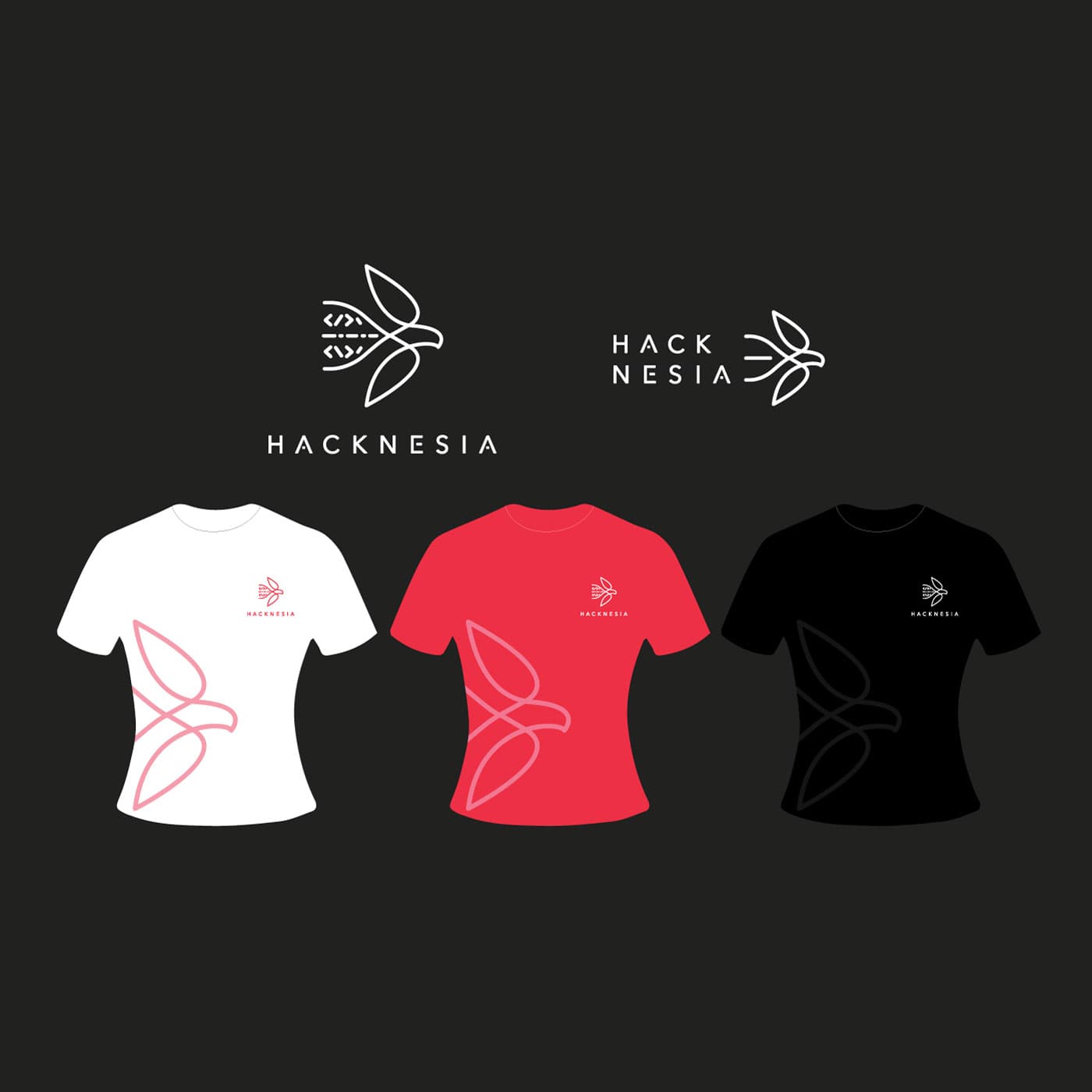
{"type":"doc","content":[{"type":"paragraph","attrs":{"textAlign":null},"content":[{"type":"text","text":"Indonesia's finest coders don't just write software — they wear their mission, and Hacknesia gives them something worthy of their craft."}]},{"type":"image","attrs":{"src":"https://farooq-agent.web.app/assets/images/works/details/220-hacknesia/hacknesia.jpg","alt":null,"title":null,"width":null,"height":null}},{"type":"paragraph","attrs":{"textAlign":null},"content":[{"type":"text","marks":[{"type":"bold"}],"text":"Brand Identity & Apparel Design — Hacknesia"}]},{"type":"paragraph","attrs":{"textAlign":null},"content":[{"type":"text","marks":[{"type":"italic"}],"text":"Logo & T-Shirt Design · Programmer Community · Indonesia"}]},{"type":"paragraph","attrs":{"textAlign":null},"content":[{"type":"text","text":"A refined, unexpected brand identity for Hacknesia — an exclusive club of Indonesian programmers united by a singular mission: to solve Indonesia's problems through the power of software and collective technical skill. The name itself is a declaration — \"Hack\" meets \"Nesia,\" code meets nation — and the identity lives up to that ambition with striking elegance."}]},{"type":"paragraph","attrs":{"textAlign":null},"content":[{"type":"text","text":"The logomark defies every expectation of what a \"hacker\" brand should look like. Rather than circuit boards, terminals, or angular tech iconography, the mark is a beautifully minimal bird in flight — constructed entirely from code bracket symbols (</>). Wings composed of angle brackets, a body assembled from dashes and slashes — the programmer's syntax transformed into organic form. It is a logo that speaks two languages simultaneously: the visual poetry of nature and the structural grammar of code. A bird in flight communicates freedom, vision, and the upward trajectory of a community that believes technology can lift a nation."}]},{"type":"paragraph","attrs":{"textAlign":null},"content":[{"type":"text","text":"The wordmark \"HACKNESIA\" is set in a clean, widely-spaced uppercase geometric sans-serif — technical yet approachable, disciplined yet open. Two lockup variations are presented: a stacked vertical version and a compact horizontal format, demonstrating systematic thinking and real-world versatility."}]},{"type":"paragraph","attrs":{"textAlign":null},"content":[{"type":"text","text":"The apparel suite brings the identity into physical community territory — three T-shirt colorways (white, red, and black) each carry the logo small at the chest and the abstract bird motif large across the front body, rendered in a tone-on-tone line treatment that gives each garment a premium, considered quality. Red signals urgency and national pride; white communicates clarity and openness; black anchors the collection in technical gravitas."}]},{"type":"paragraph","attrs":{"textAlign":null},"content":[{"type":"text","text":"A brand identity as intelligent as the community it represents — where every line of the logo is, quite literally, written in code."}]}]}
Tech Stack
Tags
Completed
December 2019
Project Scale
short Project