Oishi Hut
Table 23, Your Order, 2m 32s — Oishi Hut puts the sushi menu, cooking progress, and bill in one seamless flow that makes dining in feel as smooth as ordering online.
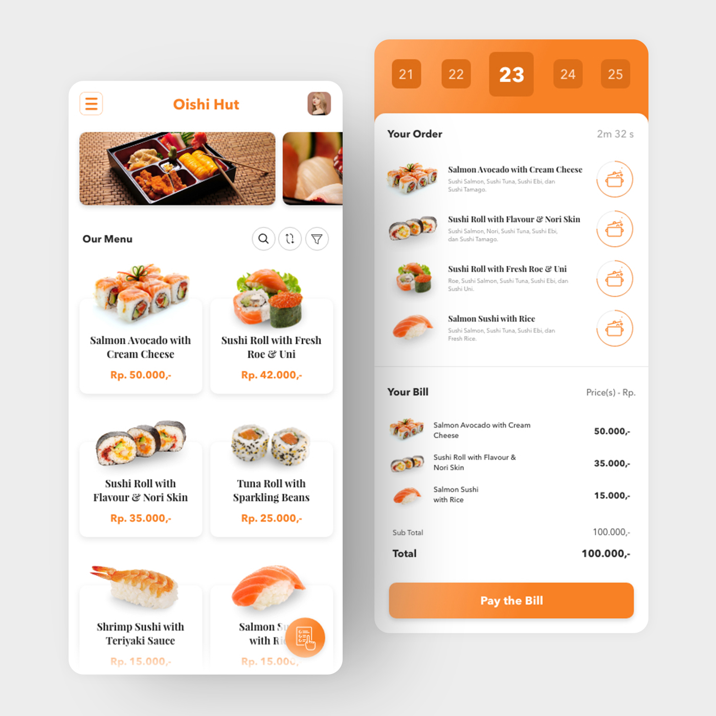
App UI Design — Oishi Hut
Restaurant App · In-Dining Order & Kitchen Tracking · Japanese Cuisine
A polished, full-featured restaurant app UI for Oishi Hut — a Japanese sushi and roll restaurant — covering the complete in-dining experience from menu browsing to kitchen progress tracking to bill payment.
Screen 1 — Menu: A clean white product grid with high-quality sushi photography, product names, and prices in orange (Salmon Avocado with Cream Cheese Rp. 50.000, Sushi Roll with Fresh Roe & Uni Rp. 42.000, Tuna Roll with Sparkling Beans Rp. 25.000). The orange accent color is the app's single most important design decision — warm, appetite-stimulating, and consistent across every touchpoint. Search, sort, and filter icons sit above the grid for power-user navigation.
Screen 2 — Order Tracking & Bill: The right screen is the app's most interesting UX layer. A table selector at the top (21–25) confirms the diner's table number — Table 23 is active. Below it, the order list doubles as a live kitchen tracker: each item has a cooking pot icon indicating its current preparation state, and a countdown timer (2m 32s) shows how long until the order is ready. The bill section below itemizes each dish with prices, sub-total (Rp. 100.000), total (Rp. 100.000), and a prominent orange "Pay the Bill" CTA.
The kitchen progress tracking feature — real-time cooking status visible to the diner — is the app's standout UX innovation. It eliminates the "where is my food?" friction that defines most restaurant experiences without requiring staff interaction.
A restaurant app that gives diners control, transparency, and hunger — in that order.
Completed
May 2019
Tags
© 2019 Hyperfantasy