StarBuss - Website Design
Professional, direct, and built for business — StarBuss's corporate website puts the right faces and the right navigation in front of every visitor from the very first scroll.
Web Design — StarBuss
Corporate Website Exploration · Business Services
A clean, professional corporate website design exploration for StarBuss — a business services company whose digital presence communicates institutional credibility, approachability, and the organized confidence of a firm that knows its clients and what they need.
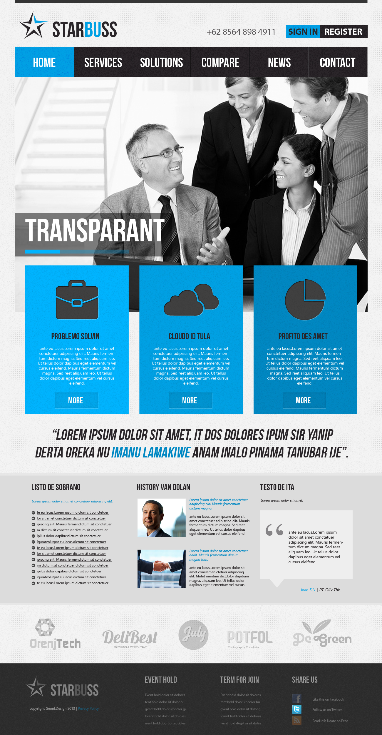
The hero section leads with a full-width black and white editorial photograph of a business team in active collaboration — a senior executive with glasses engaged in conversation with three professional colleagues — a deliberate visual choice that communicates people-first business values. The desaturated treatment gives the image a timeless, editorial quality while keeping the focus entirely on human interaction rather than environment, signaling that StarBuss's primary value is its people and their expertise.
The StarBuss logo anchors the header with a clean star icon mark — a five-pointed star with a dimensional cut, rendered in blue-grey — beside the "STARBUSS" wordmark in a bold, condensed typeface. The logo communicates aspiration and precision in equal measure. A phone number sits aligned right in the header, immediately surfacing the most direct path to human contact for visitors who arrived ready to talk.
The navigation bar — Home (active, blue), Services, Solutions, Compare, News, Contact — is structured with the logic of a B2B buyer's journey: understand the brand, explore services, evaluate solutions, compare options, read credibility signals, then contact. The blue active state on "Home" establishes the brand's accent color with economy.
The Sign In and Register buttons in the upper right confirm a platform dimension to the business — client portals, account-based access, or membership services — adding functional depth to what reads as a clean, trustworthy corporate front door.
A corporate website that does its job without decoration — because in B2B, clarity is the most sophisticated design choice of all.
Completed
March 2013
Tags
© 2013 Hyperfantasy