NOCTURE Branding
Brand Identity — NOCTUR
Logo & Stationery Design · Security / Surveillance Services
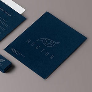
A sleek, understated brand identity for NOCTUR, presented through a premium stationery mockup that immediately communicates the brand's tone — vigilant, precise, and deeply professional. The identity is rendered entirely in deep navy blue with a tone-on-tone treatment, where the logo surfaces through a subtle contrast rather than a contrasting color — a sophisticated choice that rewards close attention.
The icon is a stylized eye with geometric interior detailing, referencing surveillance, awareness, and watchful precision — a natural symbol for a security-oriented service brand. The linework is clean and technical, balancing a sense of engineered control with restrained elegance. Paired beneath it, the wordmark "NOCTUR" is set in a spaced, uppercase sans-serif that reinforces the brand's authoritative, no-nonsense character.
The stationery suite — folder, letterhead, and business card — is presented in a flat-lay mockup on a neutral grey surface, demonstrating how the identity translates across physical touchpoints. The monochromatic deep blue across all pieces creates a unified, cohesive system that would perform equally well in digital and print environments.
A confident brand identity that channels the visual language of precision and trust — exactly what a security service needs to establish credibility at first glance.
Completed
March 2013
Tags
© 2013 Hyperfantasy