Ferrous Brand Value and Guidelines
Brand Identity — Ferrous
Logo & Brand Guidelines · Construction Steel Factory · Industrial Sector
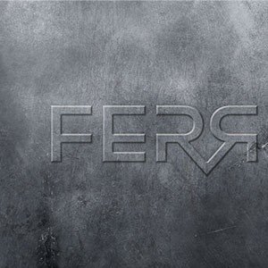
An uncompromisingly industrial brand identity for Ferrous — a construction steel manufacturer — where every design decision is an extension of the material itself. The wordmark "FERR" is rendered directly onto a raw, weathered steel surface, with a deliberately mirror-reversed final letterform that functions as both a typographic device and a symbolic gesture: a nod to the rolling and pressing processes central to steel fabrication.
The letterforms are custom-engineered — angular, wide-set, and constructed from sharp geometric strokes with beveled edges that catch light like machined metal. The typography does not merely describe the industry; it is the industry. Each letter carries structural weight and precision, communicating a brand built on material integrity and manufacturing strength.
The embossed, tone-on-tone treatment — steel grey on steel texture — creates a sense of depth without color, relying entirely on form, light, and surface to establish presence. This restraint is itself a statement: a brand confident enough to need nothing but its own material identity.
The reversed "R" doubles as a subtle logomark — a signature detail that rewards attention and creates instant brand recognizability across applications from signage to stamped steel plates.
A masterful exercise in material-driven branding — raw, authoritative, and built to last.
Completed
March 2013
Tags
© 2013 Trio & Hyperfantasy