Just Dine
Most favorite restaurants, Asia to Europe, delivered with the full dining experience — Just Dine brings the restaurant to your home without leaving the feeling behind.
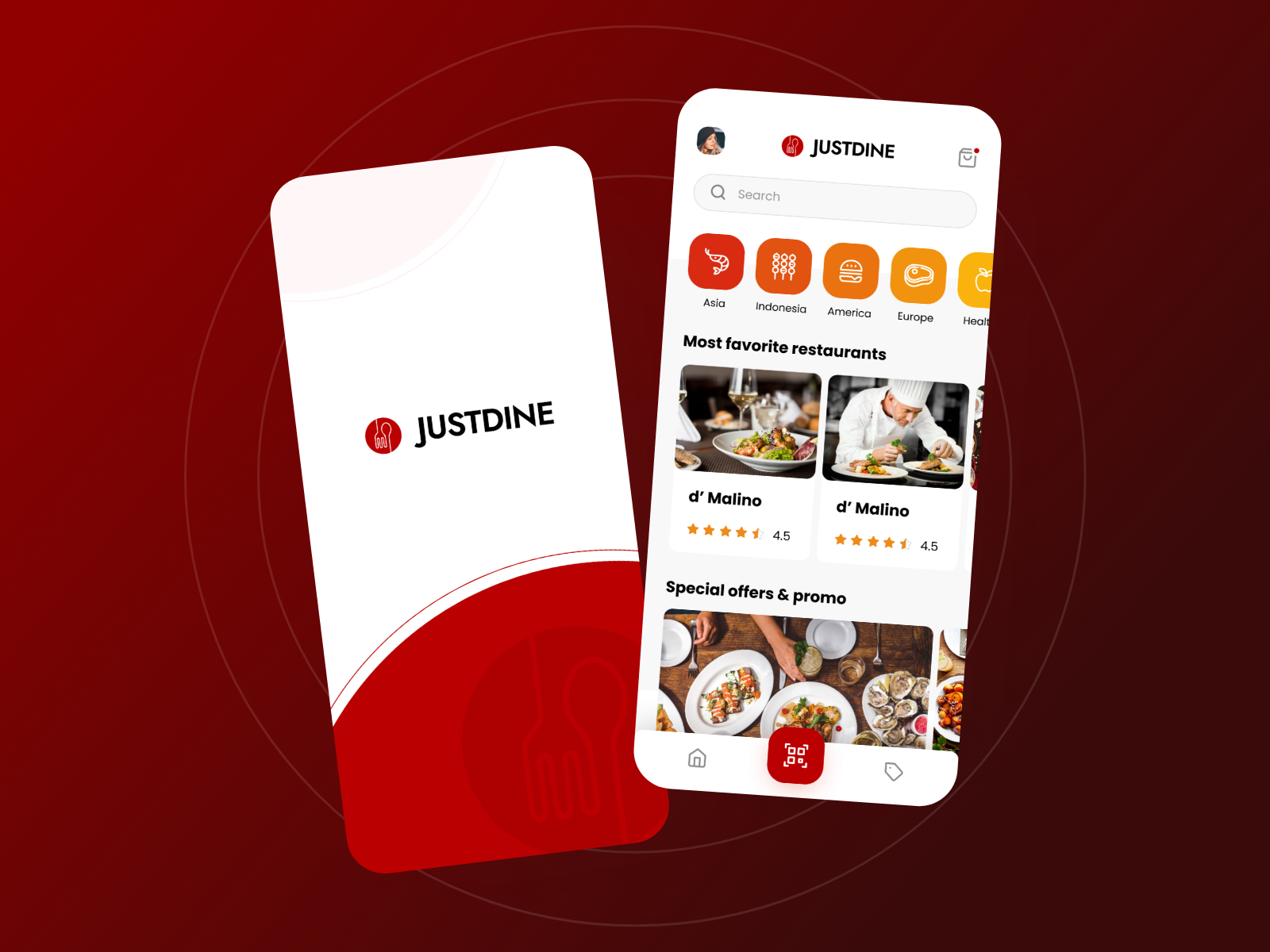
App UI Design — Just Dine
Mobile App · Food Delivery & Home Dining Experience · Restaurant Discovery
A bold, appetite-forward two-screen app UI for Just Dine — a food delivery platform with a distinct positioning: not just delivering food, but replicating the full restaurant dining experience at home.
The splash screen is clean and confident — the JustDine logomark (a cloche/dish cover icon in red) beside the wordmark on a white card with a dramatic red wave at the bottom, against a deep red background. The visual language is immediately premium: this is not a fast-food delivery app.
The home screen opens with cuisine category chips in rich gradient reds and oranges — Asia, Indonesia, America, Europe, Healthy — communicating the platform's international scope while maintaining warmth. The "Most favorite restaurants" section features d' Malino (4.5 stars) with restaurant photography that is editorial in quality — plated dishes and a chef in action, communicating the cooking craft behind the delivery, not just the food itself.
The QR code center tab in the bottom navigation is the app's most distinctive UX element — suggesting a table-side or in-restaurant scanning feature that bridges the physical and digital dining experience, consistent with the "serve like in restaurant but in home" concept.
"Special offers & promo" surfaces a food photography strip at the bottom — oysters, seafood spreads — maintaining the premium appetite appeal throughout.
A food delivery app that understands dining is an experience, not just a transaction.
Completed
October 2020
Tags
© 2021 Hyperfantasy