Nomadstay Logo Design
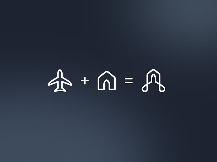
A logo that says "home" and "journey" in the same breath — the Nomadstay mark is a house, a letter, and a traveler's path, all in one continuous line.
Logo Design — Nomadstay
Brand Identity · Logo · Properties & Travel App
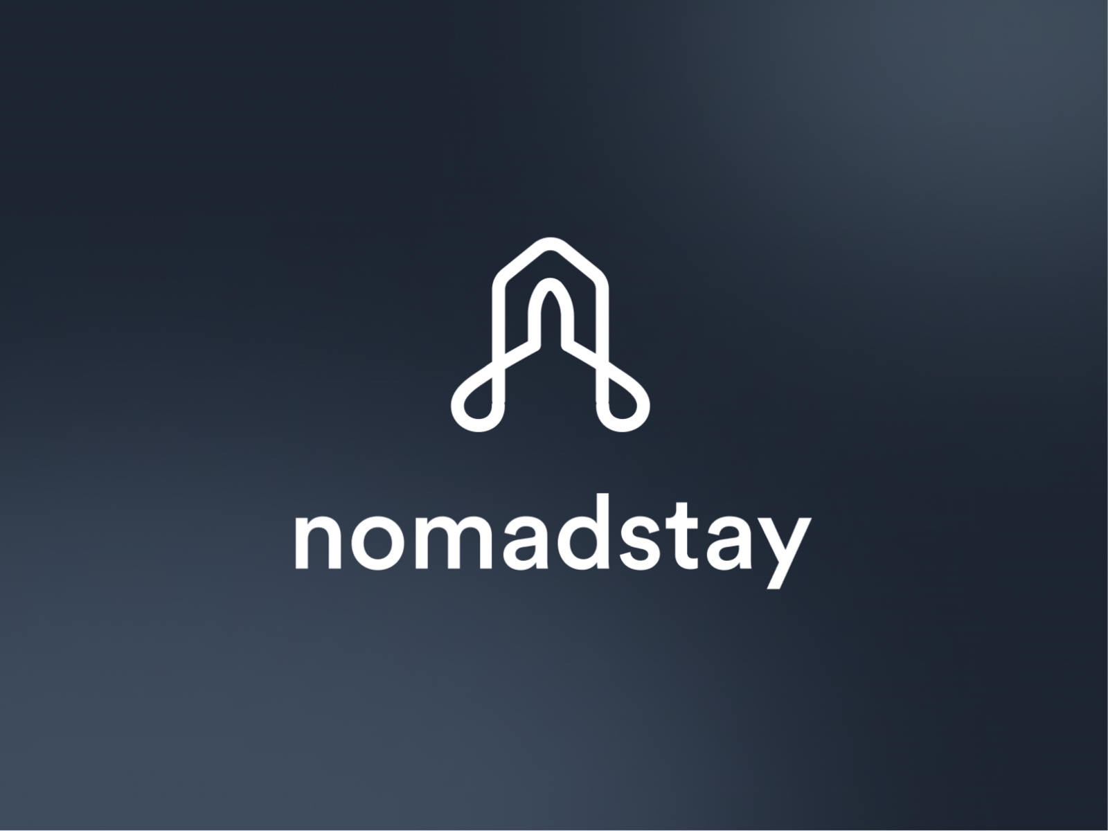
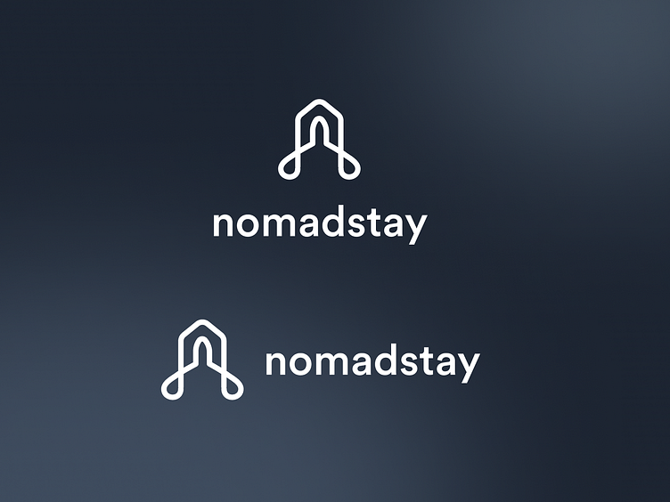
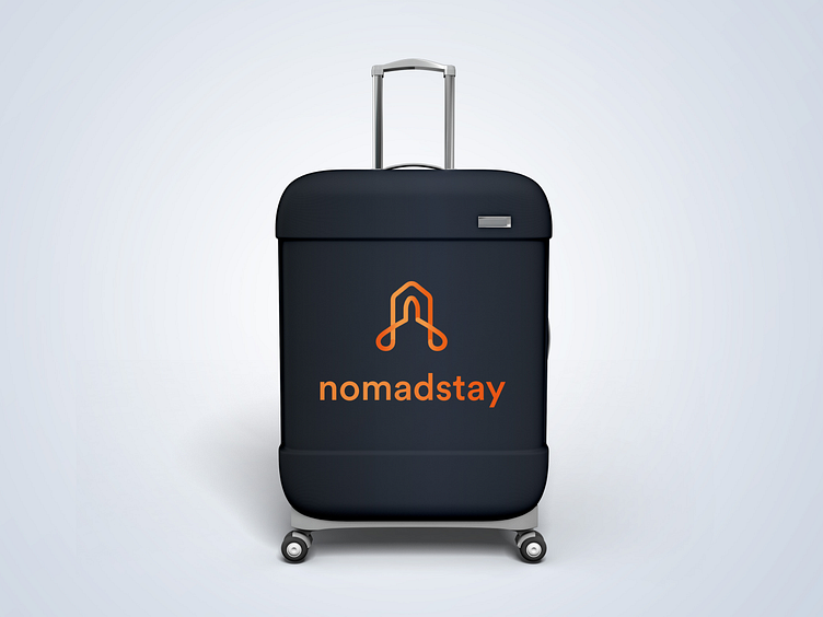
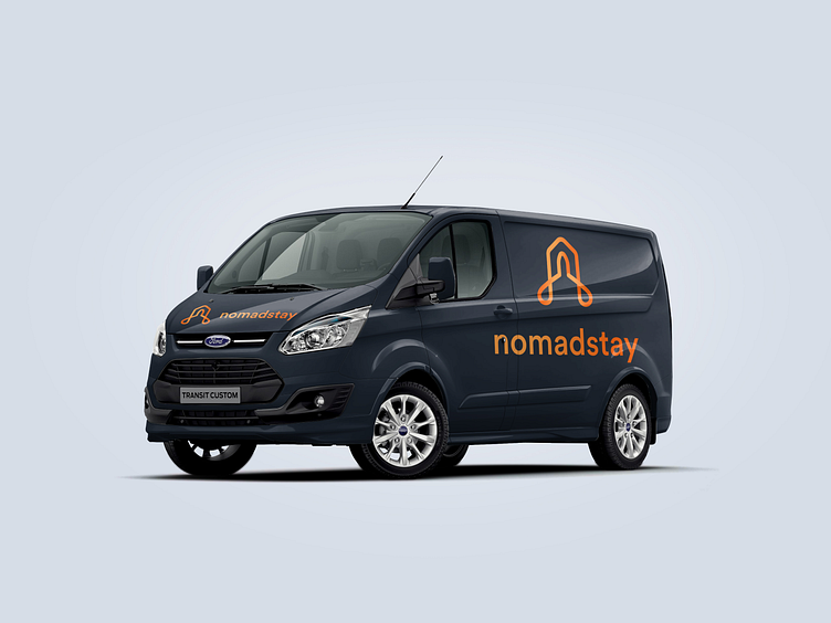
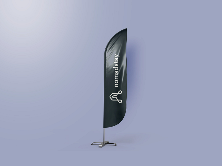
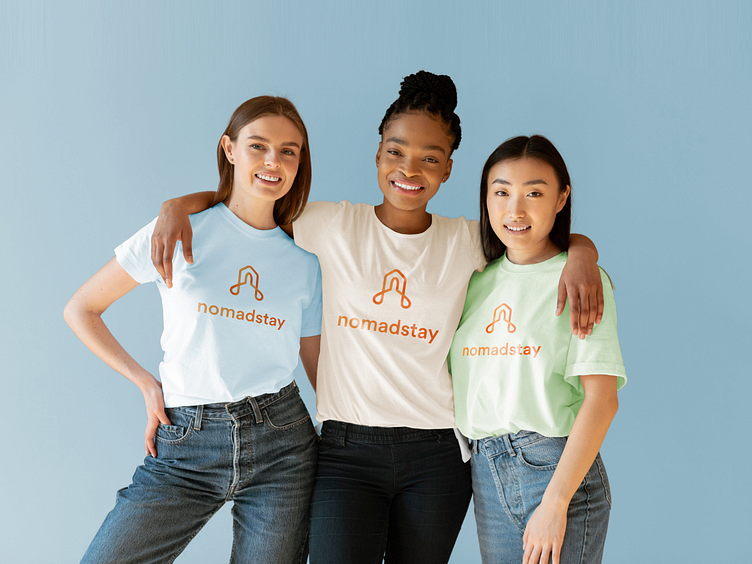
The Nomadstay logo is built around a single continuous line — a clever dual-reading mark that simultaneously reads as a house rooftop and the letter "N." The two legs of the form curve inward at the base with rounded terminals, giving the mark a fluid, organic quality that feels modern without being cold. It communicates both the stability of a home and the movement of a nomadic lifestyle — the exact tension the brand lives in.
The clean sans-serif lowercase wordmark "nomadstay" sits directly below, balancing the mark's geometric precision with approachable softness. Presented on a deep slate-blue gradient background, the white-on-dark treatment gives the logo an aspirational, premium quality — confident enough for a travel and property platform that wants to be taken seriously without sacrificing warmth. A minimal, elegant brand mark that scales from app icon to billboard without losing its identity.
AVAILABLE FOR NEW PROJECT
🖼️ UI Design | 😄 UX Design | 🎉 Illustration | 🛍 Brand Identity | 📝 Graphic Design | 🌐 Web Development | 📱 Mobile App Development
Completed
November 2021
Tags
© 2021 Hyperfantasy