Java Paradigm Branding
Java Paradigm Branding
Brand Identity — Java Paradigm
Logo & Visual Identity · Media / Creative Agency · East Java
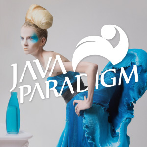
A striking media brand identity for Java Paradigm, presented here in a bold editorial context that immediately signals creative ambition. The logo is overlaid on a high-fashion editorial photograph — a deliberate compositional choice that positions the brand squarely within the world of culture, creativity, and contemporary media.
The icon is a fluid, abstract mark formed from two dynamic swooping shapes — one larger, one smaller — evoking a sense of motion, orbit, and forward momentum. The form carries a dual reading: it can be interpreted as a figure in motion or as an abstract representation of ideas in circulation, both fitting metaphors for a media brand rooted in the creative pulse of Java.
The wordmark "JAVA PARADIGM" is set in a bold, slightly condensed serif with a distinctive character — the letters carry elegance without stiffness, suggesting a brand that is authoritative yet culturally alive. The all-white rendering against the vibrant electric-blue editorial backdrop creates maximum contrast and visual presence.
The choice of photography — avant-garde fashion, bold blue tones, high concept styling — speaks to a media brand that positions itself at the intersection of culture, art, and ideas. Java Paradigm is not a generic brand; it is a statement of creative identity rooted in the cultural landscape of Java.
A sophisticated, editorially confident brand identity that stands out in any context it inhabits.
Completed
June 2013
Tags
© 2013 Hyperfantasy