MONG Branding
MONG Branding
Brand Identity — MONG
Logo Design · Business Consultancy · Strategic Advisory
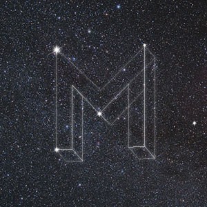
An arresting, cosmos-inspired brand identity for MONG — a business consultancy — that positions the brand in a realm far beyond conventional corporate visual language. The logomark is a three-dimensional wireframe "M" rendered as a constellation against a deep, star-scattered night sky — a single bold concept executed with striking elegance and conceptual depth.
The 3D geometric letterform is constructed from precise, luminous white lines with key vertices marked by glowing star points, as though the letter itself has been charted across the universe. The isometric perspective gives the mark structural weight and dimensionality, communicating a consultancy that thinks in systems, frameworks, and long-range vision — not surface-level solutions.
The constellation metaphor is layered with meaning: stars as fixed points of reference, navigation, and clarity — precisely what a business consultant provides amid uncertainty and complexity. The choice to render the mark against an actual deep-space photograph rather than a flat dark background elevates the identity from logo to narrative, from brand to worldview.
The restraint is remarkable — no color, no tagline, no decorative addition. Just the mark, the stars, and the infinite. This is a brand that trusts its concept completely.
A conceptually sophisticated identity that communicates intellectual authority, strategic depth, and an ambition that is — quite literally — astronomical.
Completed
October 2015
Tags
© 2015 Hyperfantasy