Gloria Cell - Frontend Development
Semua Pembayaran dalam Tiga Langkah mudah — Gloria Cell puts pulsa top-up and transaction history exactly where you need them, nothing more.
Frontend Development — Gloria Cell
Mobile App UI · Pulsa Top-Up Service · Indonesia
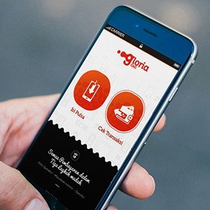
A clean, focused mobile frontend for Gloria Cell — a pulsa (mobile credit) buy and sell service. The UI is held in hand in a real-world context, confirming this is a built, deployed product — not a mockup.
The home screen is ruthlessly simple: two large circular red action buttons — "Isi Pulsa" (Top Up) and "Cek Transaksi" (Check Transaction) — centered on a white background with a circuit-pattern texture. Two actions, zero friction. The Gloria Cell logo sits above in bold orange-red, and the tagline below — "Semua Pembayaran dalam Tiga Langkah mudah" — confirms the product's core UX promise.
The dark bottom panel with the tagline creates a receipt-style tear effect — a visual metaphor that communicates the transactional nature of the service with personality rather than convention.
A utility app that gets out of the user's way and delivers exactly what they came for.
Completed
August 2015
Tags
© 2015 Trio & Hyperfantasy