HeySaladin - Web Design Revamp - Light
A Passionate Digital Product Designer — the light mode revamp of HeySaladin's portfolio opens up, breathes, and shows not just who Adin is, but exactly how he works.
Web Design — HeySaladin Revamp (Light)
Personal Portfolio Website · Designer Profile · Light Mode
The light mode counterpart to the dark revamp — same structure, entirely different atmosphere. Where dark communicates depth and intensity, light communicates openness, clarity, and approachability. Both are valid designer positioning; together they demonstrate range.
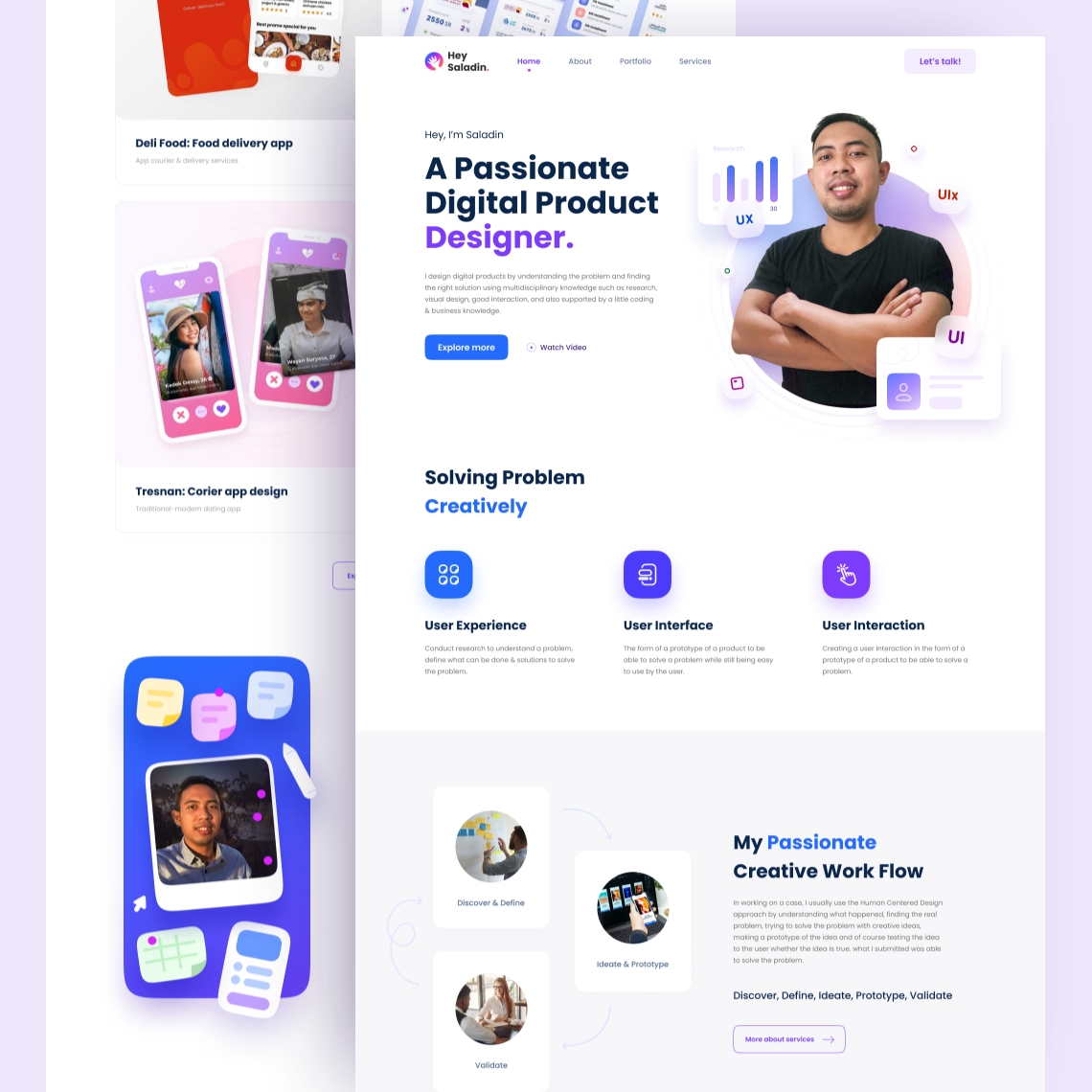
The hero is identical in structure: Adin photographed arms-crossed in a lavender bubble frame, UX / UI / UIx floating labels orbiting in purple and blue, "Hey, I'm Saladin — A Passionate Digital Product Designer." in bold black display type with "Designer." highlighted in purple. Two CTAs — "Explore more" and "Watch Video" — signal a richer content experience beyond the fold.
The service section below shifts in tone: "Solving Problem Creatively" — three discipline cards (User Experience, User Interface, User Interaction) on a clean white background with purple icon badges. The copy is more complete in this version, elaborating on each service's actual method.
The most valuable addition in the light version is the "My Passionate Creative Work Flow" section — a visual process diagram showing Discover & Define → Ideate & Prototype → Validate, with circular icons representing each phase. The process transparency is a strong portfolio differentiator: not just showing what was made, but how it was made. The Human-Centered Design methodology is explicitly named in the copy.
The portfolio left panel shows DeliFood and Tresnan projects labeled with their categories — confirming a full case study portfolio structure, not just thumbnail grids.
Two themes, one designer — the ability to switch between them says as much about the craft as any single project in the portfolio.
Completed
May 2021
Tags
© 2021 Hyperfantasy