Ruteku
"Rute Titip Jual Krupuk Rambak, Rute Antar Galon dan LPG, Rute Jogging Sabtu Pagi" — Ruteku is the route planning app that works for whoever needs it, whatever the route is for.
App UI Design — Ruteku
Mobile App · Route Planning & Management · Indonesia
A clean, practical app UI for Ruteku — a route creation, planning, and reuse tool built for anyone who travels the same paths regularly: field sales reps, delivery drivers, debt collectors, joggers, and beyond.
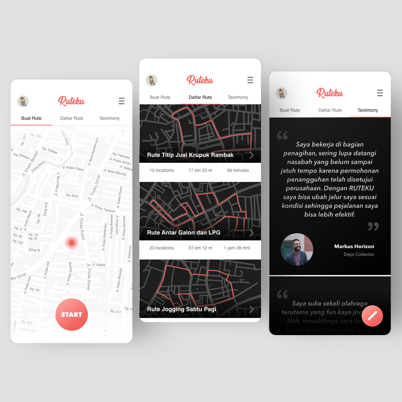
The three-screen layout maps the complete user journey across three distinct tabs — Buat Rute, Daftar Rute, Testimony.
Buat Rute (Create Route): A full-screen map with a pulsing red location pin and a prominent red "START" button — minimal, immediate, zero friction to begin recording or planning a route.
Daftar Rute (Route Library): A dark-themed list of saved routes with route preview maps, names, location counts, distances, and estimated times. Three routes are visible: "Rute Titip Jual Krupuk Rambak" (15 locations, 17km, 58 minutes), "Rute Antar Galon dan LPG" (23 locations, 27km, 1h 28m), and "Rute Jogging Sabtu Pagi" — use cases so specific and Indonesian they immediately communicate that this app was designed from real user research, not assumptions.
Testimony: A dark testimonial screen with a quote from Markus Horizon, a Dept Collector: "Dengan RUTEKU saya bisa ubah jalur saya sesuai kondisi sehingga perjalanan saya bisa lebih efektif." — the app's value proposition confirmed by a user whose livelihood depends on efficient routes.
The red-on-white brand palette is clean and action-oriented throughout. The naming convention "Ruteku" (My Route) is personal and possessive — this app belongs to its user's daily life, not just their phone.
Completed
May 2019
Tags
© 2019 Hyperfantasy