Ride Sharing
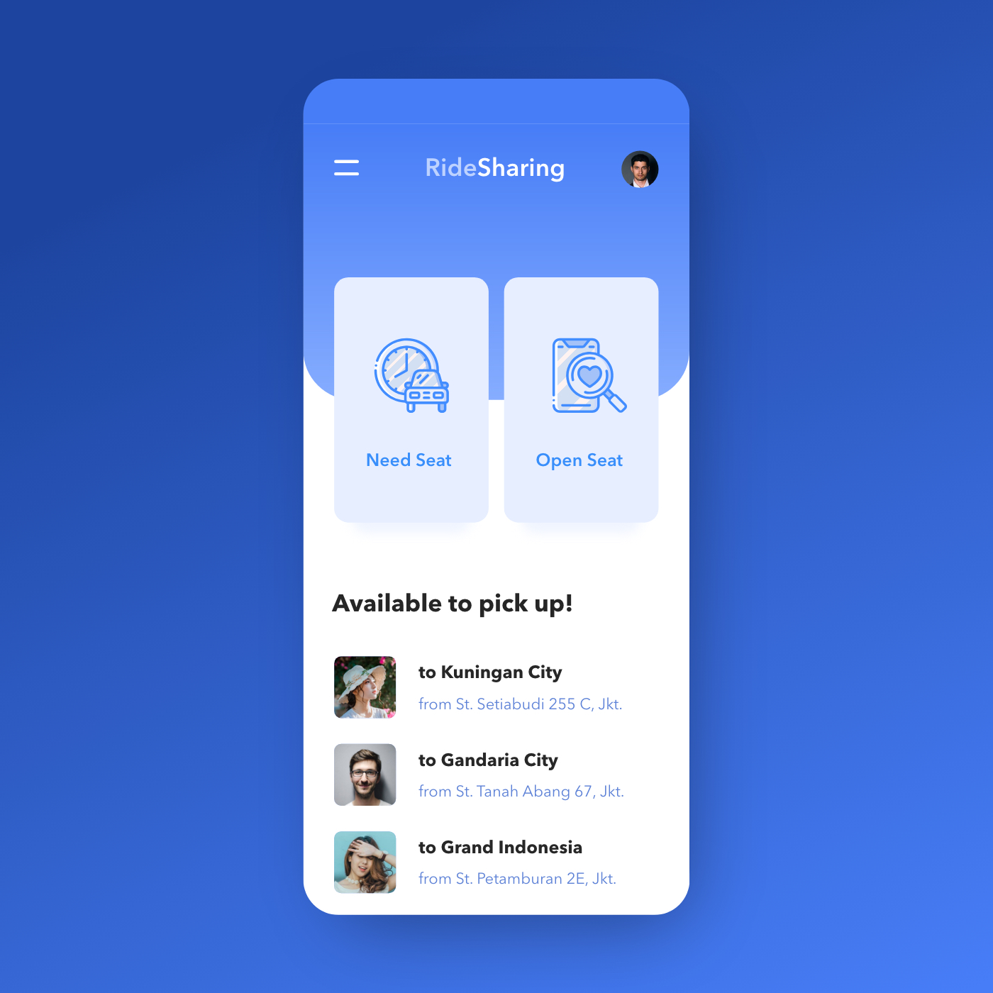
Need Seat or Open Seat — RideSharing's two-button home screen makes the entire carpooling proposition clear before a single scroll.
App UI Design — RideSharing
Mobile App Concept · Ride Sharing / Carpooling · Jakarta
A clean, single-screen app concept for RideSharing — a peer-to-peer carpooling platform where commuters either offer seats in their vehicle or look for a ride heading the same direction.
The home screen is built around a binary user intent split: two large, equal-weight action cards — "Need Seat" (I need a ride) and "Open Seat" (I'm offering a ride) — positioned side by side as the primary navigation. The icon design reinforces each mode: a scheduled car icon for Need Seat, a phone with a heart/search for Open Seat. It's a rare two-option home screen that works precisely because the product has exactly two user modes and no ambiguity between them.
Below the action cards, "Available to pick up!" surfaces three live ride offers — all Jakarta routes: to Kuningan City from St. Setiabudi 255 C, to Gandaria City from St. Tanah Abang 67, to Grand Indonesia from St. Petamburan 2E. Each listing shows the driver/rider profile photo, destination, and departure point — the minimum viable information for a commuter deciding in seconds whether a route matches theirs.
The all-blue palette — deep cobalt background, lighter blue card surfaces, blue icon line work — creates a cohesive, trust-forward visual identity appropriate for a service built on sharing a car with a stranger. The card float on the blue background gives the UI a clean, modern depth.
A carpooling app concept that solves the UX challenge of serving two distinct user types — passenger and driver — with a single home screen that handles both without confusion.
Completed
November 2019
Tags
© 2020 Hyperfantasy