Brother - Website Design 1.0
STRONGER — Brother 1.0 leads with the one word that matters most when you're selling steel filing cabinets to businesses that can't afford to compromise.
Web Design — Brother Office Equipment 1.0
Product Website · Lemari Arsip & Office Furniture · Surabaya
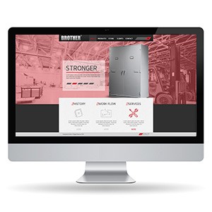
The first generation Brother website design — raw, industrial, and unapologetically bold. Where 2.0 went premium with black and gold, 1.0 goes gritty with a deep red/rose overlay on warehouse photography, establishing the brand's manufacturing credentials before a single product spec is read.
The hero headline "STRONGER" in heavy compressed type says everything the product line needs to say. A large steel filing cabinet renders center-right — clean, solid, and product-photography precise against the atmospheric industrial backdrop. The red color wash over the warehouse background is a deliberate tonal choice: industrial strength, communicated through environment rather than copy.
Below the hero, three icon strips — History, Work Flow, Services — organize the brand story in a structured three-column layout, giving buyers the full picture: who we are, how we operate, what we offer. The dark footer grounds the composition, giving the site a bottom-heavy weight that feels structural, appropriate for a brand that literally sells things built to last.
A first iteration that established the brand's tough, industrial voice — the foundation 2.0 refined.
Completed
July 2013
Tags
© 2013 Trio & Hyperfantasy