Dian Istana Logo Design Improvement
A brand that already had presence — refined into one that commands it.
Brand Identity Proposal — Dian Istana
Logo Redesign · Property Company · Brand Improvement
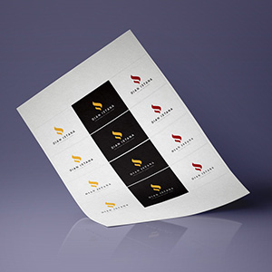
A logo improvement project for Dian Istana, presented as a comprehensive proposal sheet exploring multiple color directions — gold on black, gold on white, and deep crimson — each variant offering a distinct positioning while maintaining the same refined core mark.
The logomark is a fluid, flame-like "D" — elegant and upward-reaching, communicating growth, warmth, and architectural aspiration in a single continuous stroke. The form carries a natural luxury quality, befitting a property brand whose name translates to "Light of the Palace."
The multi-variant proposal demonstrates strategic thinking beyond aesthetics: giving the client real choices between premium-dark, clean-light, and bold-heritage directions — all grounded in the same cohesive identity foundation.
Completed
March 2015
Tags
© 2015 Hyperfantasy