Max Tape Branding Needs
Max Tape Branding Needs
Brand Identity — MAX TAPE
Vehicle Branding & Visual Identity · Adhesive Tape Manufacturer · FMCG / Industrial
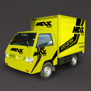
A high-impact vehicle branding execution for MAX TAPE — an adhesive tape brand — that transforms a compact delivery truck into a rolling billboard of raw commercial energy. The design is built on an unmissable combination of electric yellow and bold black, a pairing that demands attention on any road or warehouse floor and carries immediate associations with caution, power, and industrial utility.
The "MAX TAPE" logotype is rendered in a heavy, italicized custom typeface with aggressive forward momentum — the slanted letterforms convey speed, reliability, and the no-nonsense character of a brand that means business. The logo appears multiple times across the vehicle's surfaces — bonnet, door panels, and cargo box — ensuring brand visibility from every angle and distance.
Dynamic diagonal stripe elements sweep across the cargo body in black, creating a sense of motion even when the vehicle is stationary. The tagline "STICK BETTER" is set prominently on a black band across the cargo panel, a confident brand promise delivered with the bluntness of a brand that knows exactly what it does and does it well.
The 3D vehicle mockup presentation is a sophisticated portfolio choice — demonstrating not just logo design, but a full understanding of how brand identity wraps, scales, and performs across three-dimensional real-world surfaces.
A viscerally effective piece of applied branding that communicates MAX TAPE's core promise — strength, visibility, and grip — in every element of its execution.
Completed
March 2013
Tags
© Trio & Hyperfantasy