Lakoni Branding
Brand Identity — Lakoni
Logo Design · Illustration Studio · Small Creative Team
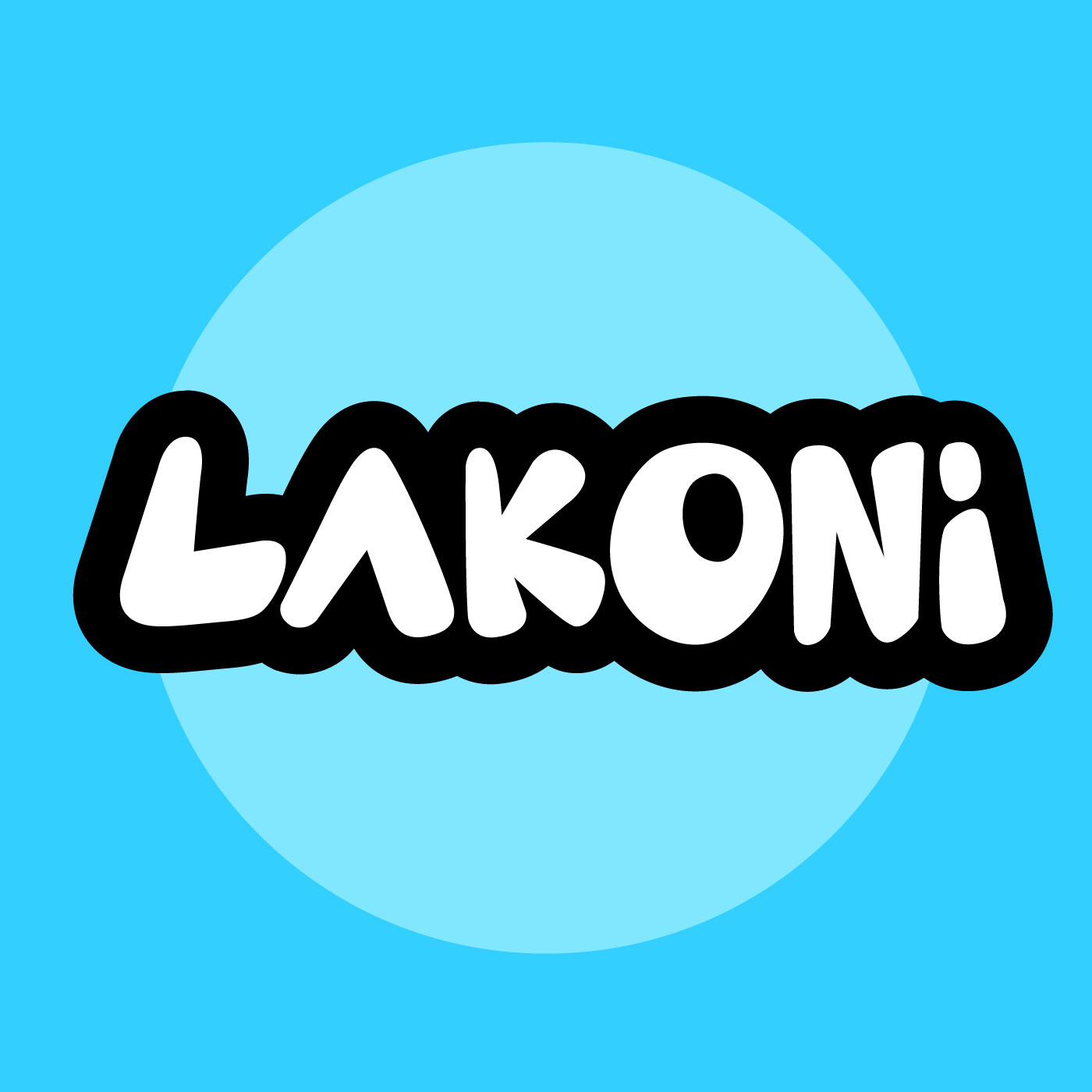
A joyfully bold wordmark logo for Lakoni — an illustration studio or small creative team — that wears its personality on its sleeve from the very first glance. The mark is built entirely from a custom bubble-letter typographic treatment: round, inflated letterforms with generous white fill and a thick black outline that gives the wordmark an almost tactile, sticker-like quality. The final lowercase "i" introduces a deliberate break in the capitalization rhythm — a small typographic wink that signals a team comfortable with personality and play.
The wordmark floats against a vibrant sky blue background, centered within a soft radial circle that creates a subtle halo effect — adding depth and drawing focus without adding visual clutter. The entire composition has the cheerful immediacy of character art and street stickers, speaking directly to a creative audience that values craft, warmth, and a healthy disregard for corporate formality.
The color palette — pure sky blue, crisp white, and bold black — is deceptively simple. It achieves maximum visual impact with minimal elements, demonstrating strong typographic confidence: when your letterforms are this characterful, you need nothing else.
A logo that communicates exactly what an illustration studio should — approachable, creative, and unmistakably human. The kind of brand identity that makes people smile before they've read a single line of copy.
Completed
March 2019
Tags
© 2019 Hyperfantasy