Welco Logo Guideline
Sweet precision — Welco's brand guide treats every curve of its logo with the same care its chocolate deserves.
Brand Guidelines — Welco
Logo Guide · Brand Perfection Document · Chocolate Company
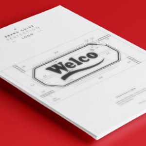
A meticulous logo guideline document for Welco — a chocolate brand — presented as a formal "Brand Guide: Perfecting Logo" sheet that deconstructs the mark with the precision of a master confectioner measuring every ingredient to the gram.
The Welco logomark is a bold, retro-styled wordmark set within a softly beveled octagonal badge — the signature form of classic confectionery branding. A confident script "Welco" sweeps across the center with warm, nostalgic energy, flanked by a smooth underline flourish that adds a handcrafted finish to an otherwise structured composition. The badge format evokes heritage quality, tin packaging, and the timeless appeal of a chocolate brand that has earned its reputation.
The construction grid overlay — spacing marks, proportional guides, anchor indicators — demonstrates the design rigor behind what appears effortlessly classic. Presented on a deep red surface that mirrors the brand's appetite-stimulating color territory, the document is as considered as the logo it governs.
Completed
February 2015
Tags
© 2015 Trio & Hyperfantasy