SBY - Website Design
Deep red, bold type, the city name as a headline — SBY's magazine website makes Surabaya feel like the most important city in the world, because for its readers, it is.
Web Design — SBY
Magazine Media Website · Surabaya · Digital Publication
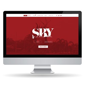
A dramatically atmospheric website design for SBY — a magazine media brand dedicated to Surabaya, Indonesia's second-largest city — built around a visual identity as confident and distinct as the city it covers. Presented in an iMac desktop mockup that frames the design's full editorial impact.
The hero section is the design's centerpiece and its most powerful statement: a full-width deep crimson red field — rich, saturated, unmistakably bold — layered over a dimmed editorial photograph of figures or a cityscape, the imagery visible as texture beneath the color wash. Rising from this field, the "SBY" masthead is set in an enormous, dramatically weighted display typeface — white letterforms that blend editorial elegance with the visual aggression of a magazine that knows its market and refuses to whisper.
The typographic treatment of "SBY" is the design's defining craft moment: the letterforms carry stylistic ink-trap details and contrasting thick-thin strokes that speak to editorial tradition — a publication that takes its city seriously and its design even more so. The masthead feels simultaneously like a newspaper nameplate and a rock poster, communicating a brand with cultural authority and genuine attitude.
Two language toggle buttons — English and Bahasa Indonesia — sit beneath the masthead, confirming the publication's bilingual ambitions and its awareness of both local and international readership. A "What's New?" CTA button invites immediate content discovery, keeping the hero section conversion-aware without sacrificing its editorial drama.
The navigation bar is clean and minimal in white against the header band — publication categories, About, and social links anchored right — keeping the information architecture accessible without competing with the hero's visual authority.
A magazine website that makes its city feel unmissable — because that's exactly what a great city publication should do.
Completed
March 2013
Tags
© 2013 Hyperfantasy