De Green - Website Design
Peace and harmony, sunflowers in bloom, ivy climbing the frame — De Green's website makes every plant lover feel like they've already walked into the garden.
Web Design — De Green
Website Design Exploration · Flower & Ornamental Plant Trader · Botanical
A warmly organic website design exploration for De Green — a platform for traders and lovers of flowers and ornamental plants — built with a visual language that feels less like a digital storefront and more like a botanical garden you've just stepped into. Presented in an iMac desktop mockup that grounds the design in its natural viewing context.
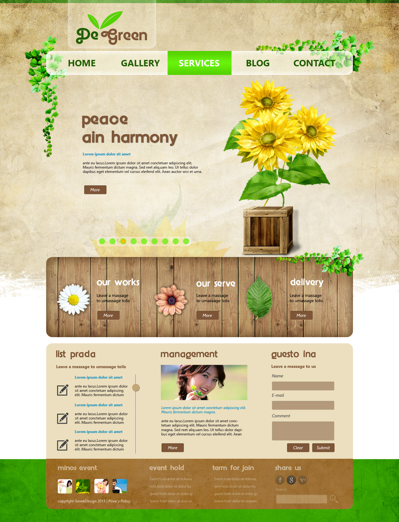
The overall aesthetic is defined by its background: a warm parchment-cream textured field that evokes aged paper, pressed flowers, and the tactile warmth of a well-loved plant journal. This is not a white-space minimal website — it is an atmospheric one, where the surface itself communicates heritage, nature, and the earthy sensibility of someone who genuinely loves plants.
The De Green logo anchors the header with a warm hand-lettered wordmark and a small twin-leaf icon in fresh green — personal, botanically precise, and entirely in harmony with the brand's identity. Cascading from the left edge of the header, a decorative ivy vine trails downward in natural, illustrative detail — not a clipart decoration but a considered compositional element that frames the page with organic life.
The hero section delivers its message with quiet, poetic confidence: "peace and harmony" set in a warm earthy display typeface against the parchment background, accompanied by a vibrant painted sunflower arrangement in the right frame — cheerful, sun-drenched, and unmistakably the work of a brand that loves what it sells. The sunflower illustration style — painterly, warm, and botanically detailed — elevates the design beyond a simple plant marketplace into something closer to a lifestyle journal for the green-thumbed.
The navigation — Home, Gallery, Services, Blog, Contact — is organized in a clean horizontal bar with a bright green "Services" active state tab, communicating the brand's personality through even its most functional element.
A website design that doesn't just sell plants — it makes you want to grow them.
Completed
March 2013
Tags
© 2013 Hyperfantasy