Elang Persada Logo
The eagle doesn't ask permission to own the sky — and neither does PT. Elang Persada.
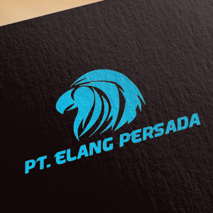
Brand Identity — PT. Elang Persada
Logo Design · Holding Company / Business Group · Corporate Identity
A fierce, commanding brand identity for PT. Elang Persada — a holding company whose name translates directly to "Eagle of the Realm" — an identity that carries the full weight of that name in every line of its mark. This is corporate branding with teeth.
The logomark is a bold, highly detailed eagle head rendered in a street-art illustration style — sharp feather strokes, an aggressive forward-facing beak, and piercing linework that conveys predatory focus and uncompromising vision. The eagle is not a soft, decorative motif; it is drawn with the intensity of an apex predator at the height of its power, communicating exactly what a holding company needs to signal to its subsidiaries, partners, and competitors alike: dominance, strategic clarity, and the will to lead.
The illustration technique — bold strokes with dramatic negative space cuts — gives the mark exceptional scalability and versatility, performing equally well embossed on corporate collateral, stamped on vehicle livery, or applied to signage across group subsidiaries.
The wordmark "PT. ELANG PERSADA" is set in a bold, italicized condensed sans-serif with a forward lean that reinforces momentum and authority. The electric cobalt blue chosen for the entire identity is a deliberate and powerful departure from the conventional navy-and-gold of most holding companies — it signals a group that is modern, dynamic, and forward-facing while retaining the gravitas that a corporate group demands.
Presented on a deep charcoal textured card, the blue-on-black rendering gives the identity a premium, high-contrast presence that commands attention at any scale.
A holding company identity built like the bird it is named after — to soar above everything else in its field.
Completed
August 2012
Tags
© 2012 Hyperfantasy