Tomonet
Potenza for ultimate handling, Turanza for smooth and quiet — Tomonet is the tire marketplace app that knows what you need before you've finished searching.
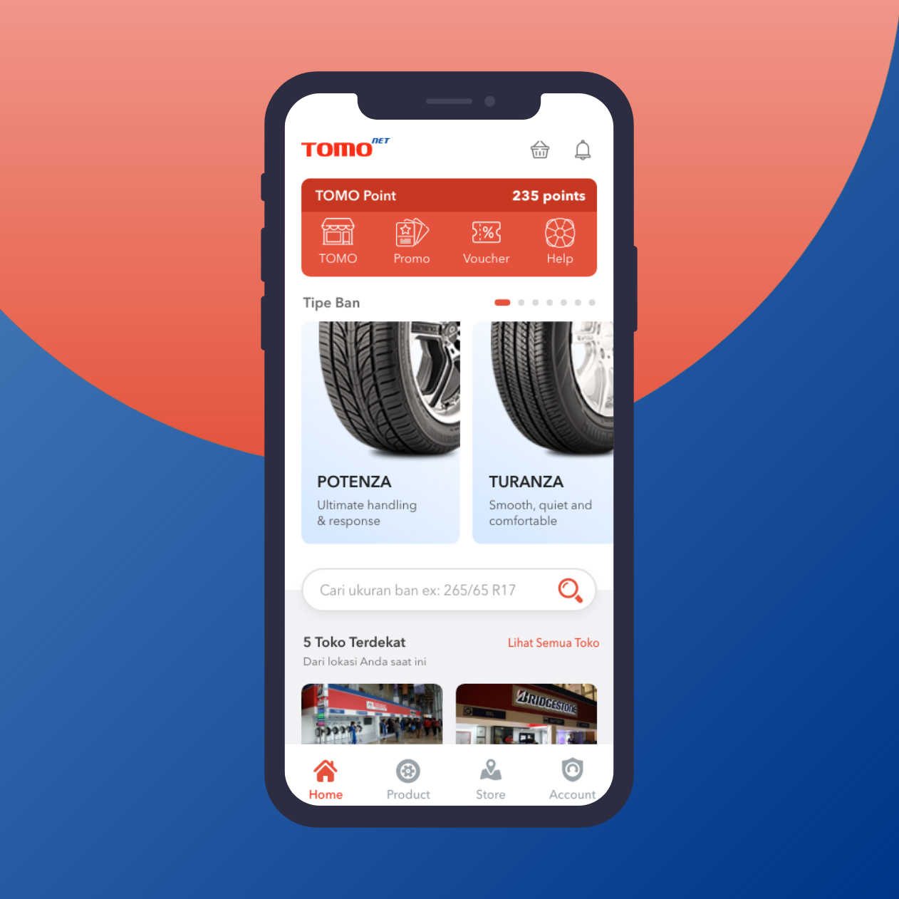
App UI Design — Tomonet
Mobile App · Tire Marketplace · Bridgestone · Indonesia
A clean, well-structured mobile app UI for Tomonet — a tire sales platform connecting buyers with tire products and nearby stores, built around the Bridgestone product ecosystem.
The home screen is organized into four clear value layers that together cover the complete tire-buying journey:
TOMO Point (235 points): A loyalty dashboard header with four quick actions — TOMO (store), Promo, Voucher, Help — gamifying repeat purchase behavior with a points system that rewards loyal customers.
Tipe Ban (Tire Types): A horizontal product carousel featuring Bridgestone's flagship lines — Potenza ("Ultimate handling & response") and Turanza ("Smooth, quiet and comfortable") — each with product photography that communicates the tire's character before a spec is read. The brief taglines are smart copywriting: they communicate performance positioning in four words.
Search by Size: "Cari ukuran ban ex: 265/65 R17" — a search bar with placeholder that educates new users on the correct format, reducing input errors and friction for a category where incorrect sizing is a real purchase risk.
5 Toko Terdekat (5 Nearest Stores): A proximity-based store discovery strip showing the closest Bridgestone/tire retailers from the user's current location — closing the loop between digital discovery and physical purchase.
The red-and-white brand palette is clean and energetic. The bottom tab bar — Home, Product, Store, Account — maps a complete e-commerce architecture in four taps.
An app that makes buying tires feel as simple as buying anything else online — which, for most people, it never has been.
Completed
July 2019
Tags
© 2019 Hyperfantasy