Key Branding
Brand Identity — Key
Logo Design · Agricultural Fertilizer Brand · Farming & Agribusiness
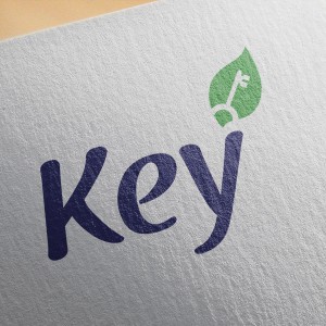
A quietly clever brand identity for Key — an agricultural fertilizer brand — that distills a complex dual promise into a single, elegantly integrated logomark. The design's central insight is the seamless fusion of two symbols: a leaf and a key, merged into one unified icon that sits atop the wordmark's ascending "y" stroke.
The leaf form, rendered in a fresh, confident green, represents nature, growth, and agricultural vitality — the foundational values of any agri-brand. Embedded within it, a classic key silhouette rendered in white delivers the brand name literally while layering in a deeper symbolic meaning: this product is the key to unlocking your soil's potential, the key to a better harvest, the key to agricultural prosperity. The concept is direct yet sophisticated — it rewards a second look.
The wordmark "Key" is set in a warm, flowing script typeface in deep navy blue — a deliberate contrast to the category norm of bright greens and earthy browns. The navy lends the brand a sense of credibility and trustworthiness that sets it apart from more rustic competitors, while the handwritten character of the script keeps it approachable and human — important for a brand speaking to farmers and agronomists alike.
Presented on a textured paper mockup, the logo demonstrates clean print performance and tactile warmth.
A deceptively simple logo that carries real conceptual depth — the kind of identity that makes clients nod and say "of course, that's exactly right."
Completed
December 2014
Tags
© 2014 Trio & Hyperfantasy