Bandar Pakan
The most well-dressed fish in the business — Bandar Pakan turns the humble world of fish feed supply into a brand with genuine personality and market presence.
Brand Identity — Bandar Pakan
Logo Design · Fish Feed Supplier · Aquaculture & Ornamental Fish
A delightfully characterful brand identity for Bandar Pakan — a supplier of live fish feed specializing in Kutu Air Depok (Daphnia) and Cacing Darah (bloodworms) — two staple feeds for ornamental and freshwater fish enthusiasts across Indonesia. In a category that rarely bothers with branding, Bandar Pakan arrives with a mascot that immediately sets it apart.
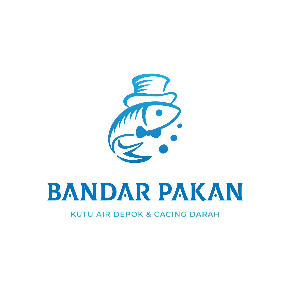
The logomark is a dapper fish in a top hat and bow tie — a charming, anthropomorphized illustration that transforms the product's subject matter into a mascot of irresistible personality. The fish stands with an air of distinguished authority, bubbles floating beside it, as if to say: this is no ordinary feed supplier. This is the one that knows its product, takes pride in its craft, and deserves a place on the shelf of every serious fish keeper. The top hat and bow tie are visual shorthand for quality, expertise, and a supplier who means business — even in the most niche of markets.
The illustration is rendered in clean, confident linework with a single ocean blue — a natural, trustworthy color deeply connected to aquatic life, freshness, and the world of fish. The monochromatic treatment keeps the mark print-friendly and highly versatile across packaging, banners, and social media.
The wordmark "BANDAR PAKAN" is set in a bold, wide serif with strong presence, anchored by the lighter tagline "KUTU AIR DEPOK & CACING DARAH" in a spaced uppercase sans-serif — clearly communicating the product range to the target buyer without ambiguity.
A brand identity that proves even the most specialized niche deserves — and benefits from — a great logo.
Completed
March 2021
Tags
© 2021 Hyperfantasy