Bapanas
When a national institution wears its identity on a grain sack — and it looks this good — you know the brand design has done something genuinely rare.
Brand Identity — Bapanas
Logo Design · Badan Pangan Nasional · National Food Agency · Republic of Indonesia
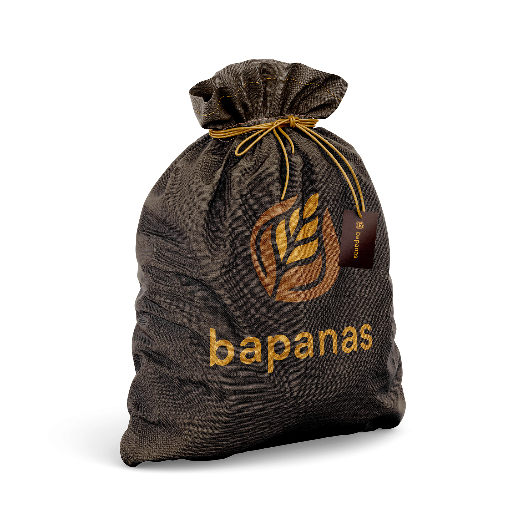
A dignified, grounded brand identity for Bapanas — Badan Pangan Nasional, Indonesia's National Food Agency — presented here in one of the most contextually resonant mockups in the portfolio: a traditional burlap grain sack, the oldest and most honest vessel of food supply, carrying a mark designed for the institution that oversees the nation's food sovereignty.
The logomark is a stylized wheat or grain stalk enclosed within a circular form — a universal symbol of harvest, sustenance, and agricultural abundance. The mark is rendered with a dual-tone warm palette: deep earthy copper and bright harvest gold — colors that speak directly to the soil, the grain, and the cycle of cultivation that feeds a nation. The circular enclosure gives the mark institutional completeness and the visual weight of a national seal, without the rigidity of bureaucratic design.
The wordmark "bapanas" is set in a clean, modern lowercase sans-serif — a deliberate choice that softens the brand's governmental authority into something more approachable and citizen-facing. In a public institution context, this lowercase humility signals a body that serves the people rather than ruling over them.
The burlap sack application is a masterstroke of contextual design thinking. The coarse woven texture of the fabric, the gold drawstring tie, the small brand hang-tag — every element reinforces the brand's connection to its mission: real food, real supply, real impact. The logo performs beautifully at this scale, its grain motif echoing the very material of the sack it is printed on.
A government brand identity that feels earned, grounded, and genuinely connected to the people it exists to serve.
Completed
November 2021
Tags
2021 Hyperfantasy