Trio Stationary
First impressions are permanent — Trio Digital Agency's business card stationery makes every handshake count with a design as sharp as the agency behind it.
Stationery Design — Trio Digital Agency
Business Card Design · Corporate Identity · Digital Agency · Indonesia & Taiwan
A sleek, premium business card design for Trio Digital Agency — a digital agency with dual offices in Surabaya, Indonesia and Taipei, Taiwan — presenting a stationery system that matches the sophistication any design-forward agency demands of its own brand collateral.
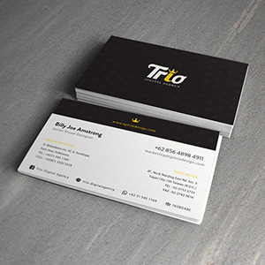
The card system employs a bold two-sided design with maximum visual contrast: the front face is a striking all-black card bearing the Trio logotype in crisp white — the wordmark "Trio" set in a confident display typeface with the "i" dotted by a gold crown icon, a small but commanding detail that elevates the mark from wordmark to symbol of creative authority. The gold accent against deep black is a timeless premium pairing, immediately signaling a studio that operates at a higher standard.
The reverse side flips to a clean white layout — a contact information card of architectural precision, organizing dual-office details, phone numbers, email, website, and social handles (including @triodigitalagency) with typographic clarity across two columns. The information hierarchy is immaculate: name and title anchored at top-left, contact details organized by office location, each section separated by subtle dividers that maintain order without adding visual noise.
The stacked card mockup on a grey concrete surface — one card face-up revealing the contact side, the full stack face-down showing the black brand face — is a classic presentation technique that demonstrates the full two-sided design system in a single composition.
A business card that does exactly what great stationery should: make the agency's work feel inevitable before a single brief has been discussed.
Completed
October 2014
Tags
© 2014 Hyperfantasy