ITACOV
UI/UX Design — ITACOV
Indonesia Tanggap COVID-19 · Mobile App Design · Public Health & Crisis Management
A comprehensive mobile application designed at the height of the COVID-19 pandemic to serve as Indonesia's citizen-facing pandemic management platform — combining real-time data, public education, personal health monitoring, and emergency response into a single, accessible digital tool. ITACOV stands as a testament to design's role in public service: clear, urgent, and deeply human in its approach.
Visual Identity The app's identity is built on a bold purple-to-violet gradient system — a deliberate departure from the clinical whites and sterile blues common in healthcare apps. The rich purple palette communicates urgency without inducing panic, authority without coldness, and digital modernity without alienating less tech-savvy users. The wordmark "ITACOV" uses typographic contrast — white for "ITA," vibrant yellow-green for "COV" — to anchor the brand name in both acronym and meaning simultaneously.
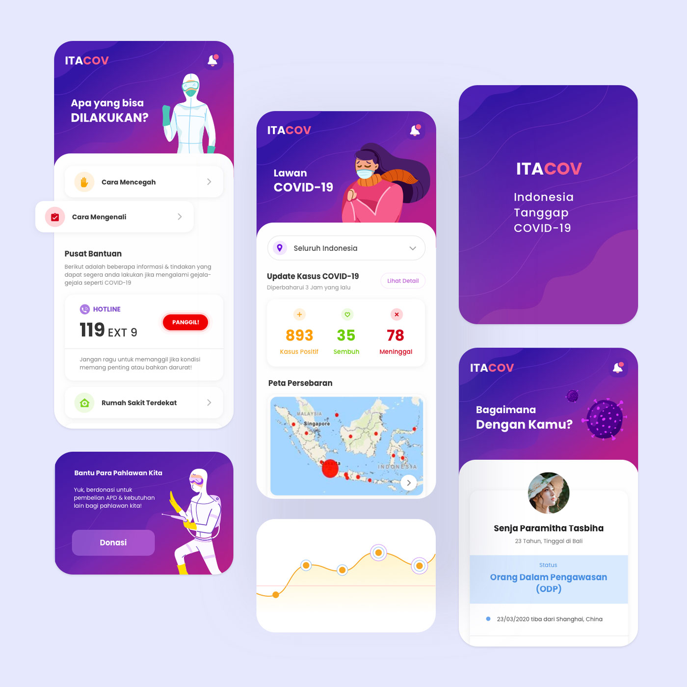
Information Architecture The multi-screen layout reveals a thoughtfully layered information hierarchy across five key screens: an action hub ("Apa yang bisa DILAKUKAN?"), a live statistics dashboard, an onboarding splash, a brand identity screen, and a personal health status card — each serving a distinct user need without overlap.
Data Dashboard The central statistics screen delivers real-time national COVID-19 data with stark numerical clarity — positive cases, recoveries, and fatalities rendered in color-coded counters (orange, green, red) against a clean white card. A geographic spread map (Peta Persebaran) overlaid on the Indonesian archipelago provides spatial context, while a trend chart beneath tracks case progression over time. Updated every 3 hours, the dashboard positions ITACOV as a trusted, living information source.
Crisis Features The emergency section surfaces the national hotline (119 EXT 9) with a prominent red "PANGGIL!" CTA and a nearest hospital locator — placing life-critical resources one tap away. A donation module for frontline healthcare workers ("Bantu Para Pahlawan Kita") adds a civic solidarity dimension, while the personal health status card — displaying travel history, age, location, and ODP status — enables citizen self-monitoring and contact tracing support.
A mature, civic-minded UI design that rises to the challenge of crisis communication — balancing data density with emotional clarity at a moment when both were desperately needed.
Completed
May 2020
Tags
© 2020 Hyperfantasy