PAEM Logo Design (Class Identity)
Logo Design — PA'EM Class Identity
Emblem / Crest Design · Student Organization · 2009
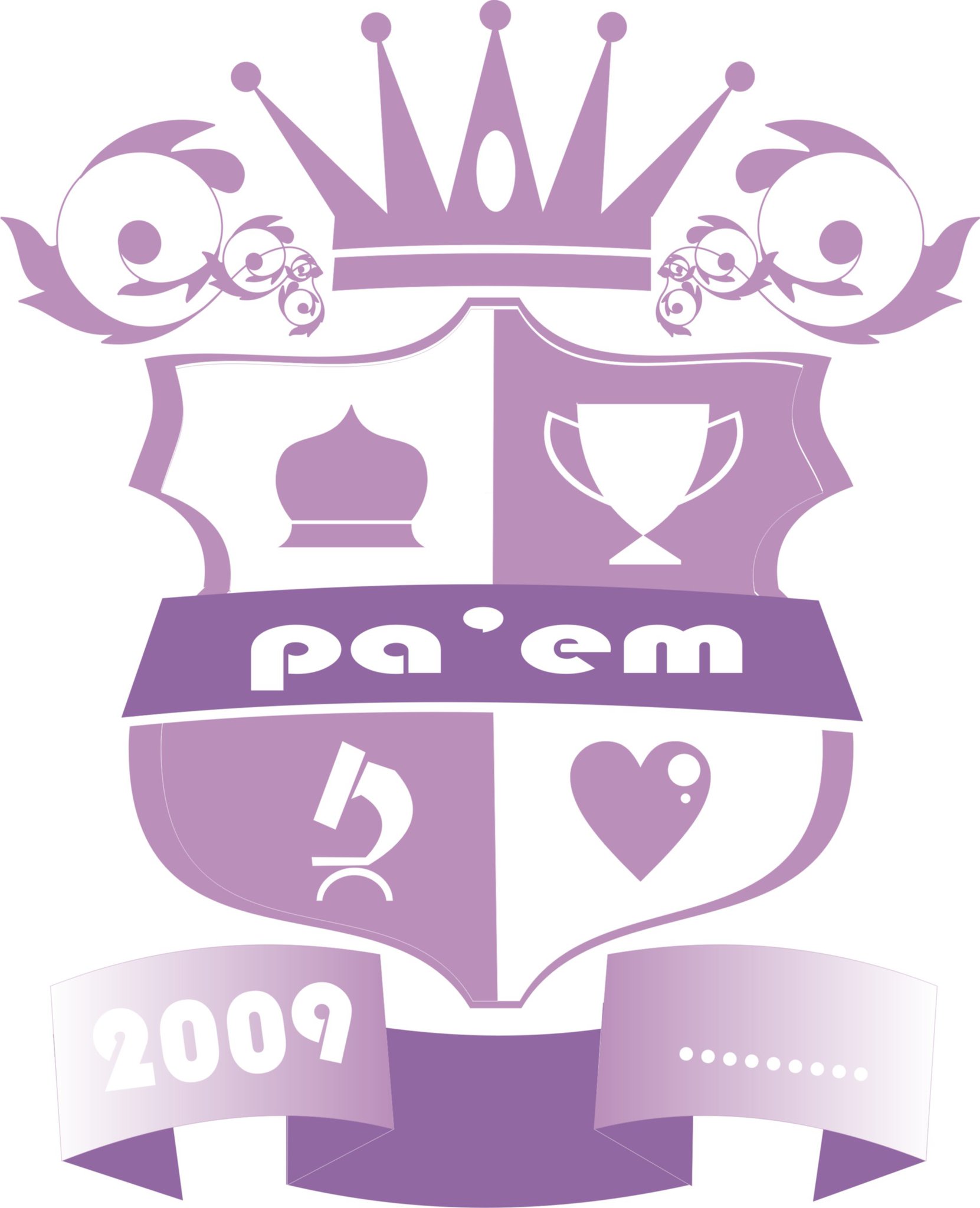
A heraldic crest logo designed for PA'EM, a student class organization, demonstrating early exploration of emblem-based identity design. The composition is structured around a traditional shield divided into four quadrants — each housing a distinct symbol: a mosque dome, a trophy, a microscope, and a heart — collectively representing the pillars of the organization's values: faith, achievement, knowledge, and community.
A regal crown sits at the apex, flanked by symmetrical baroque-style floral flourishes that add decorative character while reinforcing the crest's authoritative framing. The wordmark "pa'em" is set on a ribbon banner that bisects the shield horizontally, rendered in a rounded, approachable typeface that balances the formality of the crest with a sense of youthful identity.
The entire composition is executed in a monochromatic purple palette — ranging from deep violet to soft lavender — creating a cohesive, print-ready mark with strong scalability. A ribbon footer anchors the piece with the founding year, 2009.
A confident early exercise in heraldic composition, symbol hierarchy, and identity systems — showing instinctive understanding of how visual elements communicate organizational character.
Completed
January 2010
Tags
Hyperfantasy