Juanita Logo
Where beauty meets boutique — Juanita is the salon brand that makes every woman feel like she walked into her own fairytale.
Brand Identity — Juanita
Logo Design · Boutique & Salon · Beauty & Lifestyle
A romantically feminine brand identity for Juanita Boutique & Salon — a beauty destination that combines the indulgence of a salon with the charm of a boutique, all wrapped in one graceful visual mark. The logo is a composition of layered elegance: expressive, floral, and unapologetically feminine.
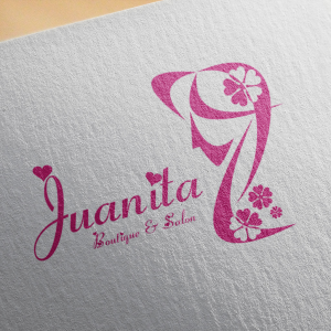
The icon is a stylized silhouette of a woman's figure — tall, slender, and poised — rendered as a flowing abstract form that simultaneously reads as the letter "J," the initial of the brand name. The double reading is seamless and satisfying: a monogram that is also a person, a letter that is also a pose. At the crown of the figure, a four-leaf clover motif adds a note of luck and charm, while delicate sakura-like blossoms scatter at the base — grounding the mark in natural beauty and feminine grace.
The wordmark "Juanita" is set in an expressive, flowing calligraphic script with heart accents dotting the letter "j" — a small but telling detail that injects warmth and personality into the typography. The tagline "Boutique & Salon" sits beneath in a lighter script, clearly communicating the dual nature of the business without competing with the main wordmark.
The single fuchsia-pink palette — warm, vivid, and distinctly feminine — is the perfect color choice for a beauty brand targeting women who want to feel celebrated. Applied consistently across the icon and wordmark on a clean white textured paper mockup, the identity radiates the kind of warmth that makes a client feel welcome before she's even walked through the door.
A salon brand identity that is as beautiful as the transformations it promises.
Completed
July 2012
Tags
© 2012 Hyperfantasy