Camp Logo Design
Logo Design — KEMBAR IV Camp Identity
Event Logo · Youth Camp · Jenu, June 2012
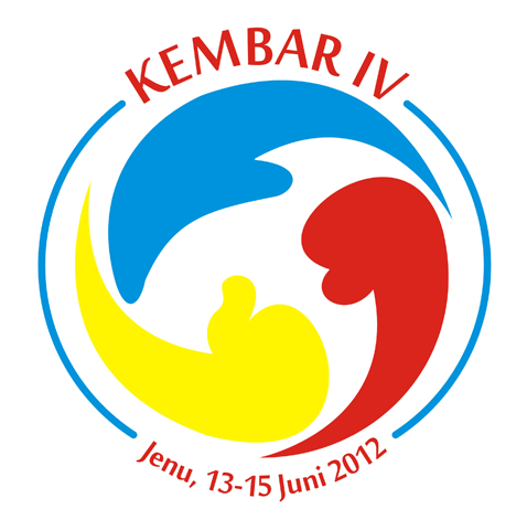
A dynamic event logo designed for KEMBAR IV, a youth camp held in Jenu, June 13–15, 2012. The mark centers on a triadic swirl composition — three interlocking figures rendered in primary colors (blue, red, and yellow) — evoking unity, movement, and the energy of collective participation.
The three abstract forms are stylized human silhouettes in motion, arranged in a continuous rotational flow reminiscent of the classic triskelion symbol. This circular rhythm communicates the spirit of collaboration and togetherness central to a camp experience. The primary color palette — bold, unblended, and confident — signals accessibility and youthful vitality without relying on gradients or decorative treatment.
A clean circular border frames the emblem, lending structure and badge-like authority to the mark. The wordmark "KEMBAR IV" arcs above in a strong red serif, while the event date and location curve below in a matching script, completing the medallion format.
An early demonstration of strong compositional instincts — the ability to encode meaning (unity of three) directly into form — executed with clarity and visual balance.
Completed
March 2010
Tags
Hyperfantasy