HAZE
PSI 27–38, PM2.5 11–16, Band 1 Normal — HAZE turns Singapore's most anxiety-inducing seasonal data into a calm, beautifully designed dashboard.
Web Design — HAZE
Air Quality Dashboard · PSI & PM2.5 Monitor · Singapore
A clean, data-forward web dashboard for monitoring haze and air quality in Singapore — one of the region's most practically important environmental tools during the annual haze season.
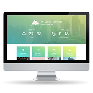
The hero is a live PSI update panel: 24-hr PSI readings (27–38) and 1-hr PM2.5 readings (11–16, Band 1 Normal) displayed in large, bold numerals against a soft teal-to-green gradient backdrop. The city skyline visible through the gradient adds environmental context — this data is about the air above those buildings, right now.
The design approach is notably calm and reassuring for what is potentially alarming information: the gradient palette is soft, the typography is clean and modern, and the cloud icon mascot at the top softens the clinical nature of air quality data without diminishing its accuracy. The color system visibly shifts with PSI levels — a critical UX decision for a health-information platform where color must communicate severity instantly.
The four content cards below — Hotspot & Satellite Images, Air Quality Information, Health Advisories, Precautions for Patients — map the full public information need during a haze event, from real-time data to actionable guidance.
A public health dashboard that makes critical environmental data accessible, readable, and calm under pressure.
Completed
December 2016
Tags
© 2016 FXmedia & Hyperfantasy