Jatim Electronic Data Icons
When government data needs to reach every citizen — icon design becomes the language that makes it universally understood, and Jatim Electronic Data gets it exactly right.
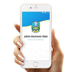
Icon Design — Jatim Electronic Data
UI Icon Set · Government Data App · East Java Province · "Data untuk Semua"
A focused icon design project for Jatim Electronic Data — the official electronic data platform of East Java Province, built under the banner "Data untuk Semua" (Data for Everyone). The project's contribution is a cohesive custom icon set designed to make complex government data categories immediately recognizable and navigable for citizens across all demographics and digital literacy levels.
The splash screen reveals the app's visual identity: a clean blue-and-white gradient backdrop carries the official East Java provincial crest — a heraldic shield representing the region's governmental authority — paired with the app name in a confident, institutional sans-serif. The ghost icon set visible in the lower half of the splash screen serves as a subtle visual preview of the icon system beneath — a sophisticated design choice that layers context and function simultaneously.
Icon design for a government data application is a discipline of its own: every mark must communicate its data category — population statistics, economic data, infrastructure, agriculture, health — at a glance, without language barriers, and at small screen sizes where clarity is non-negotiable. The icons visible suggest a line-icon approach: clean, consistent stroke weights, minimal fill, and enough visual distinction between categories to eliminate ambiguity even in a crowded grid.
A public-sector icon design contribution that serves not just an app — but an entire province's worth of citizens who deserve data that is clear, accessible, and genuinely for everyone.
Completed
April 2016
Tags
© 2016 Hyperfantasy