Inspiring Home Brand Value
Brand Identity Guidelines — Construction Brand
Logo & Stationery Design · Construction / Engineering Services
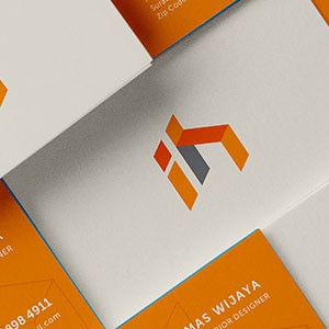
A sharp, geometry-driven brand identity for a construction services company, presented across a clean stationery suite that communicates structural precision and professional confidence. The identity system is anchored by a bold logomark constructed from isometric parallelogram forms — three interlocking planes in orange, dark orange, and slate grey — that together read as an abstracted architectural structure or assembled building component when viewed as a whole.
The isometric perspective of the mark is a deliberate design choice: it evokes technical drawings, structural blueprints, and the three-dimensional thinking inherent in construction and engineering work. The layered planes also suggest depth, stability, and meticulous assembly — all core values of a credible construction brand.
The color palette — energetic burnt orange paired with a grounding slate grey — strikes an effective balance between dynamism and dependability. Orange signals ambition, energy, and visibility on-site, while grey anchors the brand in technical rigor and trustworthiness.
The stationery system — business cards, letterheads, and branded collateral — is presented in a clean flat-lay mockup that demonstrates how the identity scales gracefully from icon to full application. The white-dominant layout keeps the brand feeling clean and modern, avoiding the heaviness common in industrial branding.
A confident, sector-appropriate identity that speaks the visual language of construction while maintaining a distinctly contemporary edge.
Completed
March 2013
Tags
© 2013 Hyperfantasy