7 Fundamental Things in Visual Design Theory
A curated breakdown of the core building blocks every designer should understand — from the simplest mark to the full composition of a page.
Visual design is far more than aesthetics. It's a structured language — a set of principles and elements that, when applied deliberately, communicates meaning before a single word is read. Over years of studying graphic design and working across digital and print mediums, I've distilled the theory down to seven foundational elements. These aren't arbitrary; they build on one another, from the most elementary mark all the way to the full orchestration of a visual composition.
Think of this article as a map, not a manual. Each point is an entry into a much deeper body of knowledge, and I've ordered them from the most elemental to the most complex — the natural progression any designer encounters as their craft matures.
Element 01
Point
Everything in visual design begins with a point. It is the most primitive mark — a single dot with no dimension, no direction, just presence. Yet even a lone point on a blank canvas carries weight. It commands attention. The eye is drawn to it instinctively.
In practice, points appear as dots, circles, focal anchors, or any isolated mark that draws the viewer's eye to a specific location. When multiple points are placed together, they begin to suggest movement, rhythm, and even implied lines. Understanding the point is understanding the nature of focus itself.
Why it matters: Designers use points to create focal areas, guide the eye through a composition, and establish visual hierarchy without relying on size or color alone.
Element 02
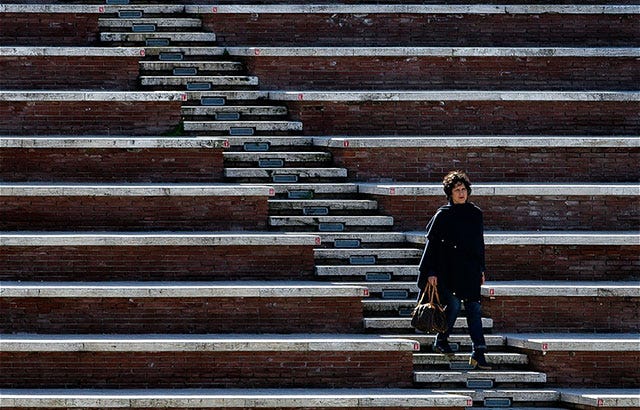
Line
A line is a point in motion. It has direction, length, and implied energy. Whether straight, curved, thick, thin, solid, or dashed — each variation carries its own emotional resonance. Horizontal lines suggest calm and stability. Vertical lines convey strength and authority. Diagonal lines introduce tension and dynamism.
Lines are workhorses in design: they divide space, create borders, direct the eye, suggest movement, and establish structure. They can be literal (a rule between sections) or implied (a row of objects the eye follows). Mastering the line is mastering the flow of a composition.
Why it matters: Lines are one of the most expressive tools available. Their character — weight, texture, direction — dramatically shapes the mood and readability of any design.
Element 03
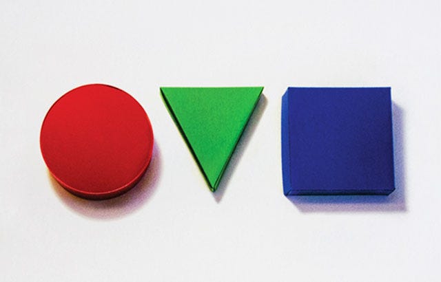
Shape
When a line closes in on itself, a shape is born. Shapes are two-dimensional areas defined by edges — they can be geometric (circles, squares, triangles) or organic (freeform, fluid, irregular). Each carries distinct psychological associations: circles feel safe and continuous, squares suggest stability and trust, triangles imply direction and tension.
Shapes also operate as negative space — the areas between and around them are just as communicative as the shapes themselves. Great designers think in terms of both positive and negative space simultaneously, using shapes not just to fill a canvas but to sculpt it.
Why it matters: Shape choice is among the most powerful nonverbal signals in design. Logos, icons, and layout forms all use shape psychology to communicate before the viewer has consciously processed anything.
Element 04

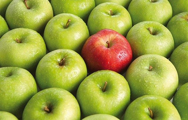
Color
Color is perhaps the most emotionally immediate element of visual design. Before the brain processes shape or type, it processes color. Hue, saturation, and value — the three dimensions of color — each play a role in how a palette feels. Color theory encompasses the relationships between colors: complementary, analogous, triadic, and more.
Beyond aesthetics, color carries cultural weight and functional responsibility. In UI design, color communicates state (success, warning, error). In brand design, it builds recognition and personality. Accessibility considerations — such as sufficient contrast ratios — mean that color decisions are never purely decorative.
Why it matters: A color palette can make or break a design's effectiveness. Choosing colors intentionally — with attention to harmony, contrast, and cultural context — is what separates considered design from decoration.
Element 05
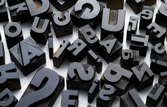
Typography
Typography is the visual representation of language. It governs not just what is said, but how it feels to read. Typeface selection, size, weight, leading (line spacing), tracking (letter spacing), and alignment all contribute to the reading experience — and to the overall personality of a design.
Typography is deeply connected to hierarchy: large headlines command attention, body text sustains reading, captions provide context. A well-executed typographic system communicates structure without requiring the reader to consciously decode it. Conversely, poor typography is invisible until it becomes friction.
Why it matters: In most digital and print design, type occupies the majority of the visual field. How it's set — the choices around it, not just the words themselves — defines the reading experience and the brand's voice.
Element 06
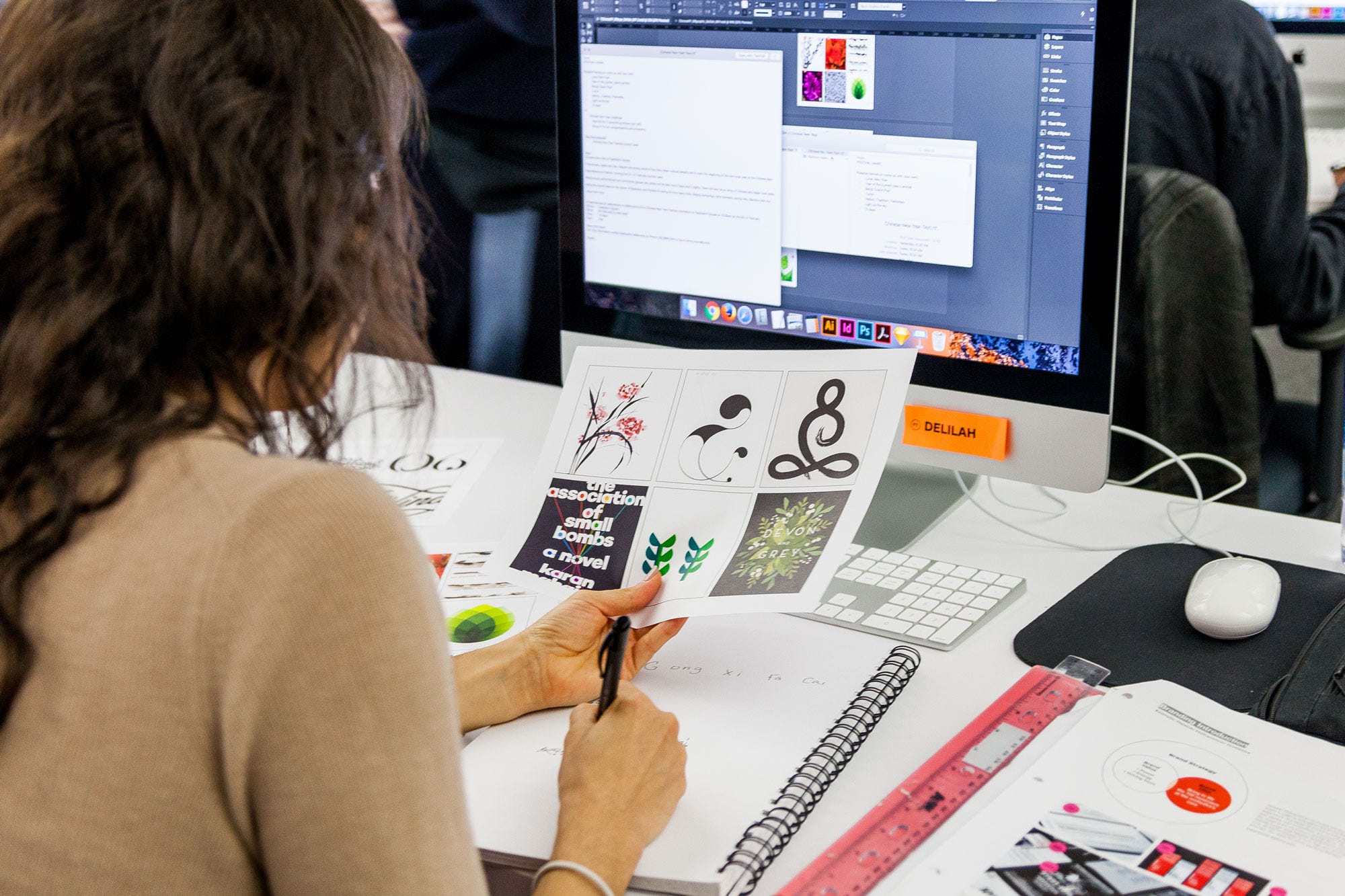
Illustration
Illustration is the expressive layer — the element that gives a design a distinctive human voice. Unlike photography, illustration is interpreted reality, shaped by the hand (or stylus) of the creator. It carries personality, warmth, and specificity that stock imagery often fails to achieve.
In modern digital design, illustration encompasses everything from iconography and spot illustrations to full editorial artwork and motion graphics. A strong illustration style can become the most recognizable aspect of a brand. It communicates in situations where words fall short — and it does so instantly.
Why it matters: Illustration is one of the primary ways design achieves uniqueness. A custom visual language — even a simple one — differentiates a product or brand in a way that borrowed assets never can.
Element 07
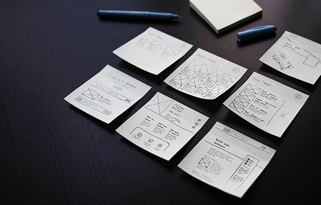
Layout
Layout is the synthesis of everything above. It is the act of arranging all the visual elements — point, line, shape, color, type, illustration — into a coherent, purposeful composition. Layout determines what the viewer sees first, what they see next, and what they carry away. It is fundamentally about hierarchy and flow.
Grid systems provide the underlying architecture. Proximity groups related information. Alignment creates order and clarity. White space (or negative space) gives content room to breathe. Together, these decisions determine whether a design communicates or confuses.
Why it matters: Even individually strong elements fail without good layout. Composition is what transforms a collection of assets into a design — the organizational intelligence that makes everything else work together.
These seven elements are not a checklist — they're a lens. The best designers don't consciously think "point, line, shape" as they work; those principles have become second nature, internalized through study and practice until they operate intuitively. But when a design isn't working, returning to these fundamentals is almost always where the answer is found.
Design theory isn't about rigidly following rules — it's about understanding why things work so you can break the rules deliberately, with full awareness of what you're doing and why. That's the difference between style and craft.
This article is a summary overview. Each element above is a rich area of study in its own right — worth exploring in depth through dedicated resources, experimentation, and practice.